How Can We Help?
Module Breakdown
MODULE BREAKDOWN
This is a reference list of all the modules created from the site design. Using this list with the build out of a page will help keep things streamlined.
0.0.0-global-floating-badge
This badge can be place anywhere in page and can be any type of icon. The idea is to use it as a CTA (Call to Action) or to break the grid design. It could be used to denote a new item, something important, special messaging etc.
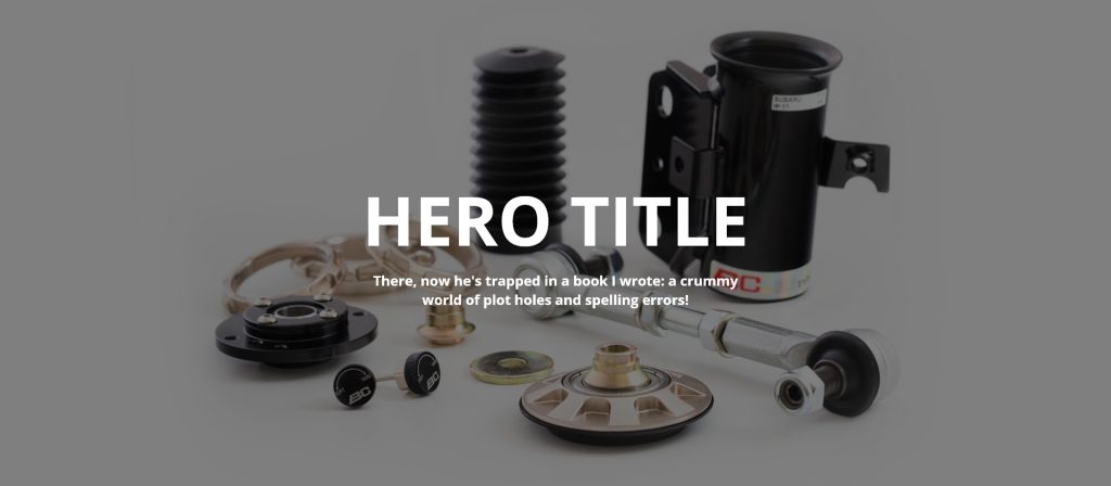
0.0.1-module-hero
The hero space, usually at the top of each page, can be an image or video. This module is just that a simple image. The dimensions we’ve stuck to are 1920×840.
0.0.1-module-hero-copy-overlay
This module is the same as the above hero but with the added copy overlay. Same ideas apply it can be an image or a video but have the added darkened background and copy for a title and subtitle or description copy.
0.0.2-module-series
Module used for the main series selection on the home page. It could be reused as a multiple item click area.

0.0.3-module-image-left-copy-right
As the name implies this module has an image on the left and a copy area on the right with a CTA. This can be used with an image or an icon or possibly a video.

0.0.4-module-image-right-copy-left
This is a variation on the above module. Copy is now on the left and the image is on the right. In this view the image is an icon.

0.0.5-module-image-left-social-gallery-right
Using the similar left / right style module, the social widget is added to the right side and the left contains an icon.

0.0.6-module-image-stacked-above-copy
Making a statement at the bottom of the page is always nice especially on the homepage. The purpose of this module is to act as a “Who we are” so there is no need to create an About page. These elements can be sprinkled throughout the site to give the user a feeling of BC presence. The top is an icon with some description text below.

1.0.2-module-image-left-copy-right-slim
This module is a slim version of the 0.0.3 module but geared towards a driver or series item and used mostly on those main pages. The icon on the left with a title and description followed by a CTA.

1.1.2-module-copy-left-and-right
A double copy module with customizable backgrounds and text colors to adapt to wherever it’s placed. This instance is mainly used for the series detail pages, with a description on the left with an item list of features on the right.

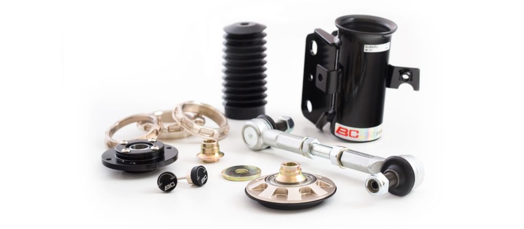
1.1.3-module-interactive-coilover
This module will contain different variations of the BC coilovers. The goal would be to have the each series represented with an “exploded” view that the user can explore by hovering and clicking on the parts to learn more. Each part will also link to the corresponding item in the store so the user can purchase.

2.1.3-module-title-quote
A simple quote module that can be used anywhere. In this instance it’s used to separate items in the driver details pages.

2.1.6-module-image-gallery
This module is a grid of photos that once clicked will open in a lightbox overlay and allow the user to click/swipe through all of the photos in the gallery. This is mainly used in the driver detail pages.

2.1.7-module-email-capture
Newsletters or just general email capture is always a handy tool. This particular one is talking about joining the Drift Club assuming it exists, a user could add their email and get updates from BC. This particular module resides on the driver detail pages.

3.0.1-module-logo-slim
This slim module is just an image or icon used as a header. It can be implemented anywhere. It currently resides in the Parts page.
3.0.3-module-image-stacked-above-copy-slim
Similar to the 3.0.1 module this includes some area for copy and is used to break up content in the Parts page.

3.1.3-module-video-thumb-pagination
Video thumbnails that get pulled from YouTube channel or playlist. This is specific to the Tech page. Each thumbnail corresponds to a tech video that will load in the player with accompanying data below using a 1.1.2 module.

3.2.3-module-image-left-copy-right-slim-no-cta
Slim version of the 0.0.3 module with no CTA. An icon is the ideal content on the left followed by a title and description area on the right.

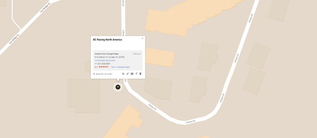
4.0.1-module-hero-map
An interactive map takes the place of a standard 0.0.1 hero image or video. This would be an embedded Google Map location. The example below uses a customized version of Googles Map editor. The full map can be found here.
4.0.3-module-copy-left-contact-form-right
This module is used mainly for the contact page. It contains contact numbers, hours of operation, the physical address and a contact form.

5.0.2-module-copy-full-width
Standard block of copy with a title that inherits the overall style of the BC branding. Can be used anywhere large chunks of copy need to be.

6.0.2-module-image-left-copy-right-slim-cta
This is a 3 column version of the 0.0.3 & 3.2.3 module where the CTA is on the right rather than under the title and description copy.

6.0.3-module-distributor-table
By removing the table and creating “cards” with lists the distributor table will flow better into mobile devices and creates a less cluttered look. Each items links to it’s corresponding site.
